Philipp Trommler's Blog

Tiny Bits: SVG icons

Tiny Bits is (hopefully) going to be a more or less regular series of posts about small ideas, actions or changes, that are important regardless of their size. This time: SVG icons for my curriculum vitae website.

Published (modified ) by Philipp Trommler. This article has also been translated to: de.

Initial situation

My curriculum vitae website used the two Font Awesome free fonts "solid" and "brands" to display four icons (for location, Github, e-mail address and a link to this blog) right at the top. I think this is a nice way to give recruiters the most important links at a quick glimpse, which is why I've taken this over from the LaTeX CV that the website is based on. Alas, this has made the site not exactly smaller.

Of course, my CV site wasn't that remarkable in terms of modern web design, but bearing in mind that I'm always striving for efficiency and minimalism, the state could not be tolerated any longer. In addition, my privacy paranoia emerged in this context, too: Since I don't use Font Awesome's CDN (or any other) in order to prevent my visitors from being tracked and because my site is usually viewed once – thus always for the first time –, browser caching could not reduce the problem.
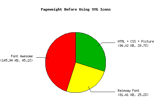
A pie chart showing the percentual shares of different parts of my 
CV website. HTML, CSS and the profile picture have a share of 96.02 KB 
(29.7 %), the Raleway font 81.41 KB (25.2 %) and Font Awesome 145.94 KB 
(45.1 %).
The pageweight before switching to SVG icons in terms of transmitted bytes. The web fonts are taking up nearly three fourths of the size with Font Awesome alone weighing in nearly the half, just for four icons. Note that the weight of the profile picture depends on the visitor's display resolution.

Speaking about the hard numbers, web fonts made up nearly three fourths of the transmitted bytes for my visitors (227.35 KB, 70.3 %), with Font Awesome alone taking nearly half of the page weight. (145.94 KB, 45.1 %). This was just as horrible as it sounds, all that for just four icons.

You may ask how it could come to this situation. Well, I was (and still am *cough*) in a phase of a "professional re-orientation" and the site just had to be finished. Styling a HR-facing website just as this one here was no option and I knew that I would come back later and clean up the mess that I left. I hope this is an adequate excuse 😉.

The solution

Of course the solution is plain SVG icons. Why should you include multiple web fonts containing hundreds of icons when you could instead only include exactly those four icons that you need? Thus, I've taken a look for available icons fitting my needs.

I've found the SuperTinyIcons which hold what they promise with their name. Each and every icon is under 1 KB giving me a theoretic size reduction of about 97 %. Additionally, the README claims that the size can be reduced even further by removing round edges and the background in its entirety, which I'd have to do anyway.

Sadly, they don't really match the look of the Font Awesome icons that I used before and that I still use for my LaTeX CV. Since I want both the PDF and the website to look as identically as feasible and adding SuperTinyIcons to LaTeX seemed not like an option, using these icons was not possible. Luckily, Font Awesome is an Open Source font and you can find the SVGs it's based on on Github. So I decided to stay with the same icons I've used before even if that means a bit larger file sizes. I mean, in the end it will still be much smaller than before.

From here on it's quite simple: Download the icons you use, open them in Inkscape and set the canvas size to 512 times 512 pixels. I've decided to scale the icons down to 50 % because the icon font was "scaled down", as well, which was probably the only tricky part. If you use Inkscape's built-in scale function, it'll add a style="scale:50%" to the path element of the SVG, but this seems to be ignored by the browser (at least by Firefox). Instead you'll have to use the width and height inputs at the top of Inkscape's window and manually re-center the path afterwards (don't forget to hit the lock icon in order to ensure proportional scaling).

With everything set up correctly in Inkscape, save the SVG and open it up in your favorite text editor (we all know that it's vim 😜) because we need to get rid off a lot of – for our use case – unnecessary meta data that Inkscape has put into the SVG. What you see will probably be something like this:

 1
 2
 3
 4
 5
 6
 7
 8
 9
10
11
12
13
14
15
16
17
18
19
20
21
22
23
24
25
26
27
28
29
30
31
32
33
34
35
36
37
38
39
40
41
42
43
44
45
46
47
48
49
50
51
52
53
54
55
56
<?xml version="1.0" encoding="UTF-8" standalone="no"?>
<svg
   xmlns:dc="http://purl.org/dc/elements/1.1/"
   xmlns:cc="http://creativecommons.org/ns#"
   xmlns:rdf="http://www.w3.org/1999/02/22-rdf-syntax-ns#"
   xmlns:svg="http://www.w3.org/2000/svg"
   xmlns="http://www.w3.org/2000/svg"
   xmlns:sodipodi="http://sodipodi.sourceforge.net/DTD/sodipodi-0.dtd"
   xmlns:inkscape="http://www.inkscape.org/namespaces/inkscape"
   viewBox="0 0 512 512"
   version="1.1"
   id="svg841"
   sodipodi:docname="rss.svg"
   width="512"
   height="512"
   inkscape:version="0.92.3 (2405546, 2018-03-11)">
  <metadata
     id="metadata847">
    <rdf:RDF>
      <cc:Work
         rdf:about="">
        <dc:format>image/svg+xml</dc:format>
        <dc:type
           rdf:resource="http://purl.org/dc/dcmitype/StillImage" />
        <dc:title></dc:title>
      </cc:Work>
    </rdf:RDF>
  </metadata>
  <defs
     id="defs845" />
  <sodipodi:namedview
     pagecolor="#ffffff"
     bordercolor="#666666"
     borderopacity="1"
     objecttolerance="10"
     gridtolerance="10"
     guidetolerance="10"
     inkscape:pageopacity="0"
     inkscape:pageshadow="2"
     inkscape:window-width="1920"
     inkscape:window-height="1121"
     id="namedview843"
     showgrid="false"
     inkscape:zoom="0.5"
     inkscape:cx="288"
     inkscape:cy="288.00062"
     inkscape:window-x="-9"
     inkscape:window-y="-9"
     inkscape:window-maximized="1"
     inkscape:current-layer="svg841" />
  <path
     d="m 201.18908,347.40454 c 0,20.21087 -16.38399,36.59489 -36.59483,36.59489 -20.21084,0 -36.59425,-16.38402 -36.59425,-36.59489 0,-20.21086 16.38399,-36.59489 36.59483,-36.59489 20.21084,0 36.59425,16.38459 36.59425,36.59489 z m 100.37705,27.00002 C 296.79243,286.06164 226.03191,215.21187 137.59485,210.433 132.37485,210.15071 128,214.34501 128,219.57244 v 27.46802 c 0,4.80858 3.70857,8.84115 8.50685,9.15315 63.90394,4.16229 115.12733,55.25833 119.29818,119.29839 0.31257,4.79829 4.34514,8.50686 9.15314,8.50686 h 27.46797 c 5.228,5.7e-4 9.42228,-4.3743 9.13999,-9.5943 z m 82.42793,0.16458 C 379.1975,240.9576 271.69416,132.82493 137.43028,128.00494 132.27028,127.8198 128,131.98837 128,137.15123 v 27.46745 c 0,4.92857 3.90571,8.94001 8.83028,9.14229 109.24505,4.47944 196.92954,92.18065 201.4084,201.40874 0.20171,4.92457 4.21314,8.83029 9.14228,8.83029 h 27.4674 c 5.16228,-5.7e-4 9.33085,-4.27086 9.1457,-9.43086 z"
     id="path839"
     inkscape:connector-curvature="0"
     style="fill:#ffffff;fill-opacity:1;stroke-width:0.57142806" />
</svg>

(If there's still no scroll bar for the code sample when you're reading this: Sorry, I'm working on it! If there is one: You're welcome!)

When we boil the file down to the important parts, we end up with:

1
2
3
<svg xmlns="http://www.w3.org/2000/svg" viewBox="0 0 512 512">
  <path fill="#fff" d="m 201.18908,347.40454 c 0,20.21087 -16.38399,36.59489 -36.59483,36.59489 -20.21084,0 -36.59425,-16.38402 -36.59425,-36.59489 0,-20.21086 16.38399,-36.59489 36.59483,-36.59489 20.21084,0 36.59425,16.38459 36.59425,36.59489 z m 100.37705,27.00002 C 296.79243,286.06164 226.03191,215.21187 137.59485,210.433 132.37485,210.15071 128,214.34501 128,219.57244 v 27.46802 c 0,4.80858 3.70857,8.84115 8.50685,9.15315 63.90394,4.16229 115.12733,55.25833 119.29818,119.29839 0.31257,4.79829 4.34514,8.50686 9.15314,8.50686 h 27.46797 c 5.228,5.7e-4 9.42228,-4.3743 9.13999,-9.5943 z m 82.42793,0.16458 C 379.1975,240.9576 271.69416,132.82493 137.43028,128.00494 132.27028,127.8198 128,131.98837 128,137.15123 v 27.46745 c 0,4.92857 3.90571,8.94001 8.83028,9.14229 109.24505,4.47944 196.92954,92.18065 201.4084,201.40874 0.20171,4.92457 4.21314,8.83029 9.14228,8.83029 h 27.4674 c 5.16228,-5.7e-4 9.33085,-4.27086 9.1457,-9.43086 z"/>
</svg>

As you can see, this retains newlines and indentation for readability and is still a great improvement size-wise. You could use this as-is in your CSS as long as you escape all special chars (i.e. < and >), but I prefer base64-encoding it before usage. This can be easily done with the base64 command that is available on most GNU/Linux distributions. The encoded data is then added to the CSS:

 1
 2
 3
 4
 5
 6
 7
 8
 9
10
11
12
13
14
15
16
17
18
19
20
21
22
ul.icons li.icon-blog:before {
    content:
        url('data:image/svg+xml;base64,\
             PHN2ZyB4bWxucz0iaHR0cDovL3d3dy53My5vcmcvMjAwMC9zdmciIHZpZXdCb3g9IjAgMCA1MTIg\
             NTEyIj4KICA8cGF0aCBmaWxsPSIjZmZmIiBkPSJtIDIwMS4xODkwOCwzNDcuNDA0NTQgYyAwLDIw\
             LjIxMDg3IC0xNi4zODM5OSwzNi41OTQ4OSAtMzYuNTk0ODMsMzYuNTk0ODkgLTIwLjIxMDg0LDAg\
             LTM2LjU5NDI1LC0xNi4zODQwMiAtMzYuNTk0MjUsLTM2LjU5NDg5IDAsLTIwLjIxMDg2IDE2LjM4\
             Mzk5LC0zNi41OTQ4OSAzNi41OTQ4MywtMzYuNTk0ODkgMjAuMjEwODQsMCAzNi41OTQyNSwxNi4z\
             ODQ1OSAzNi41OTQyNSwzNi41OTQ4OSB6IG0gMTAwLjM3NzA1LDI3LjAwMDAyIEMgMjk2Ljc5MjQz\
             LDI4Ni4wNjE2NCAyMjYuMDMxOTEsMjE1LjIxMTg3IDEzNy41OTQ4NSwyMTAuNDMzIDEzMi4zNzQ4\
             NSwyMTAuMTUwNzEgMTI4LDIxNC4zNDUwMSAxMjgsMjE5LjU3MjQ0IHYgMjcuNDY4MDIgYyAwLDQu\
             ODA4NTggMy43MDg1Nyw4Ljg0MTE1IDguNTA2ODUsOS4xNTMxNSA2My45MDM5NCw0LjE2MjI5IDEx\
             NS4xMjczMyw1NS4yNTgzMyAxMTkuMjk4MTgsMTE5LjI5ODM5IDAuMzEyNTcsNC43OTgyOSA0LjM0\
             NTE0LDguNTA2ODYgOS4xNTMxNCw4LjUwNjg2IGggMjcuNDY3OTcgYyA1LjIyOCw1LjdlLTQgOS40\
             MjIyOCwtNC4zNzQzIDkuMTM5OTksLTkuNTk0MyB6IG0gODIuNDI3OTMsMC4xNjQ1OCBDIDM3OS4x\
             OTc1LDI0MC45NTc2IDI3MS42OTQxNiwxMzIuODI0OTMgMTM3LjQzMDI4LDEyOC4wMDQ5NCAxMzIu\
             MjcwMjgsMTI3LjgxOTggMTI4LDEzMS45ODgzNyAxMjgsMTM3LjE1MTIzIHYgMjcuNDY3NDUgYyAw\
             LDQuOTI4NTcgMy45MDU3MSw4Ljk0MDAxIDguODMwMjgsOS4xNDIyOSAxMDkuMjQ1MDUsNC40Nzk0\
             NCAxOTYuOTI5NTQsOTIuMTgwNjUgMjAxLjQwODQsMjAxLjQwODc0IDAuMjAxNzEsNC45MjQ1NyA0\
             LjIxMzE0LDguODMwMjkgOS4xNDIyOCw4LjgzMDI5IGggMjcuNDY3NCBjIDUuMTYyMjgsLTUuN2Ut\
             NCA5LjMzMDg1LC00LjI3MDg2IDkuMTQ1NywtOS40MzA4NiB6Ii8+Cjwvc3ZnPgo=');
}

Outcome

The outcome is just as expected: The overall page weight could be reduced drastically from 323.37 KB to 179.56 KB – a reduction of more than 44 %. The size of the transmitted HTML file (that contains the now added CSS) increased by about 2 KB (note that the lines of CSS including the font files could be removed, though) whereas the Font Awesome files were about 146 KB, which is more or less the expected size reduction for the icons only of about 97 %, even though I've used the Font Awesome SVGs.
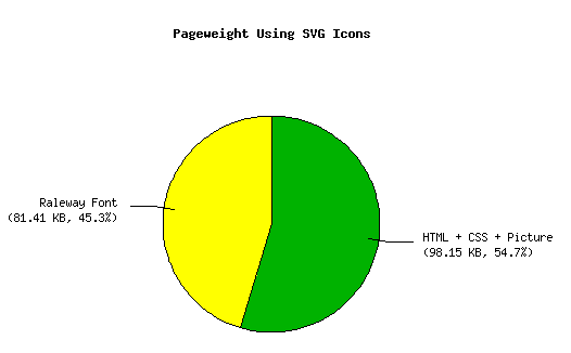
A pie chart showing the percentual shares of different parts of my 
CV website. HTML, CSS and the profile picture have a share of 98.15 KB 
(54.7 %) and the Raleway font 81.41 KB (45.3 %).
The pageweight after switching to SVG icons in terms of transmitted bytes. The web fonts are now taking up less than the half of the size. Note that the weight of the profile picture still depends on the visitor's display resolution.

The Raleway font that is still left takes up about 45 % of the page size now, but I can accept the weight that it adds way easier than the size of the Font Awesome font for two reasons (besides that it's only half the size):

  1. Raleway adds more to the overall look of the website than the four icons at the top. It's a really nice font and an eye-catcher. The size of the Font Awesome font didn't stand in a healthy relation to what it added design-wise.
  2. The website works (technically) well without it. For people like me who have web font loading disabled by default (for obvious reasons, take a look at this article! 🤐), the website doesn't break because of the Raleway font. Everything is still readable and looks reasonably decent.

In other words: The icons are smaller now. And this is true both for the file size as well as their appearance, because I didn't match their original size exactly, as you can see on the following picture:
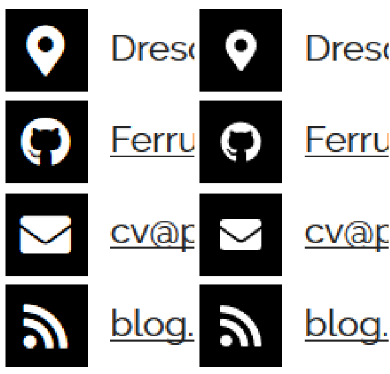
Two screenshots of my CV website showing the logos from the top of 
the page once using the font and once using the SVG icons. The icons using the 
SVGs are noticeable smaller.
Icon size comparison: On the left is the old version using Font Awesome's web font and on the right is the new version using SVGs. The difference is small but noticeable in direct opposition.

One last interesting thing I stumbled upon while working on this: When editing the Github icon I decided to remove the small dots on the tail of the Octocat. They aren't noticeable in the size the icon is displayed anyways. Before removing them the base64-encoded SVG had 2906 bytes, afterwards it had 1451 bytes. I cannot imagine that this is solely because of the removed dots but probably because Inkscape cleaned up the path element once it was edited more than just resizing. Maybe making subtle changes on the other icons before saving could reduce their size even further 🤔.

Filed under Tiny Bits. Tags: fonts, icons, svg, web.

Want to comment on this article? Write me at blog [at] philipp-trommler [dot] me!

Articles from blogs I follow around the net

Less Data Doesn't Mean a Lesser Experience
via Writing on Web Performance Consulting | TimKadlec.com, August 30, 2019

After yesterday’s post, someone on Twitter expressed concern about providing a “degraded experience” to users who have Save-Data enabled. It’s far from the first time I’ve heard this concern expressed. A user sees “Save Data” as an option and says, “Yeah, …

A GUI to re-order fields in a table
via BASHing data, August 30, 2019

A shell script for building a new table with reordered fields

The Companies Behind the Burning of the Amazon
via Mighty Earth, August 29, 2019

New analysis from Mighty Earth shows the incentives for the Amazon's destruction come from international agribusinesses like JBS and Cargill. The post The Companies Behind the Burning of the Amazon appeared first on Mighty Earth.

Generated by openring